Difference between revisions of "Logo"
(New page: =Morevna Project Logo= First attempt by Terry Hancock, using project artwork (by Konstantin Dmitriev?): Image:morevna_project_logo.png Opinions solicited. I'm not totally happy with...) |
|||
| Line 9: | Line 9: | ||
I wasn't sure whether to keep the text "motors" in the drawing or not, seeing as it's partially obscured. I compromised by making the color less intense so it doesn't compete with the foreground text so much. | I wasn't sure whether to keep the text "motors" in the drawing or not, seeing as it's partially obscured. I compromised by making the color less intense so it doesn't compete with the foreground text so much. | ||
| − | The | + | Second version, after comments from Konstantin: |
| + | |||
| + | [[Image:morevna_project_logo.svg]] | ||
| + | |||
| + | And the SVG extension for the wiki seems to be working! | ||
| + | |||
| + | The only problem I have with this one is that it won't look good at small sizes. I'll probably have to do an alternative design for 100pixels or smaller. | ||
| + | |||
| + | Still working on variations. It looks okay with the background white as well. | ||
Revision as of 18:38, 12 February 2010
Morevna Project Logo
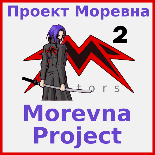
First attempt by Terry Hancock, using project artwork (by Konstantin Dmitriev?):
Opinions solicited. I'm not totally happy with the colors -- the background looks pink on my monitor, even though it's officially "gray". Optical illusion, apparently. I made the English text larger since that's what the project is using for development. I liked this pose of Morevna, because it's just a little mysterious -- like a "teaser trailer.
I wasn't sure whether to keep the text "motors" in the drawing or not, seeing as it's partially obscured. I compromised by making the color less intense so it doesn't compete with the foreground text so much.
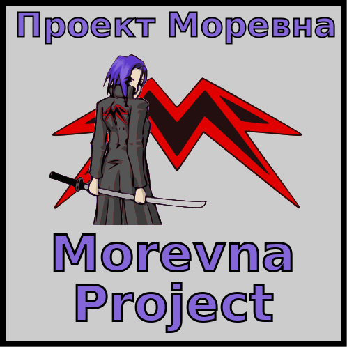
Second version, after comments from Konstantin:
And the SVG extension for the wiki seems to be working!
The only problem I have with this one is that it won't look good at small sizes. I'll probably have to do an alternative design for 100pixels or smaller.
Still working on variations. It looks okay with the background white as well.

