Difference between revisions of "Battlefield"
Richardwad1 (talk | contribs) (→Terrain: compass suggestion) |
m (Reverted edits by Christine (Talk) to last version by KonstantinDmitriev) |
||
| (24 intermediate revisions by 4 users not shown) | |||
| Line 1: | Line 1: | ||
| + | [[Category:Battlefield]] | ||
| + | |||
== Summary == | == Summary == | ||
| Line 21: | Line 23: | ||
This is just an ideas. You may or may not follow them or suggest your own. It seems what those ideas are not make any significant influence on the background shots, but maybe some history details will help us to make this place more interesting. | This is just an ideas. You may or may not follow them or suggest your own. It seems what those ideas are not make any significant influence on the background shots, but maybe some history details will help us to make this place more interesting. | ||
| − | == | + | == Lighting and atmosphere == |
Time of the day: dusk. | Time of the day: dusk. | ||
| Line 31: | Line 33: | ||
(^ Don't look at the colors, just the clouds type.) | (^ Don't look at the colors, just the clouds type.) | ||
| − | + | Discussion on sky color here: [[Image:Battlefieldsky.jpg|100px]] | |
| + | |||
| + | richardwad1 - How will we make the transition from the new brighter colors to the darker helicopter scene? | ||
| + | |||
| + | Zelgadis - Something like this: [[Image:Battlefieldsky-transition.gif]]. It will happen at shot number 39. | ||
| + | |||
| + | Lighting should be similar to exposed on pictures below: | ||
[[Image:Dusk-1.jpg]] [[Image:Dusk-2.jpg]] [[Image:Dusk-3.jpg]] [[Image:Helicopter-dusk.jpg]] | [[Image:Dusk-1.jpg]] [[Image:Dusk-2.jpg]] [[Image:Dusk-3.jpg]] [[Image:Helicopter-dusk.jpg]] | ||
| Line 80: | Line 88: | ||
I imagine buildings without lights. But buildings should have glass parts to reflect/refract helicopters headlights. When sun goes down and helicopters appearing their headlights becoming a new lightsource for the scene. They moving, light is reflecting from glass and refracting through the falling petals. Also, for battlefield scene there is no street lights there. About scene with tractor trailer I not sure for now, have to think about it. In any case we could try to make a few variants and choose then. | I imagine buildings without lights. But buildings should have glass parts to reflect/refract helicopters headlights. When sun goes down and helicopters appearing their headlights becoming a new lightsource for the scene. They moving, light is reflecting from glass and refracting through the falling petals. Also, for battlefield scene there is no street lights there. About scene with tractor trailer I not sure for now, have to think about it. In any case we could try to make a few variants and choose then. | ||
| + | |||
| + | |||
| + | == richardwad1 status updates == | ||
| + | |||
| + | Just a quick update. I've been out of town for about a week. Getting back to work in the next couple of days. Leave any ideas/suggestions for the battlefield backgrounds here! | ||
| + | |||
| + | |||
| + | [[Image:battlefield5.jpg|200px]] | ||
| + | |||
| + | click on the thumbnail to see the updated picture. The thumbnails are not updating. | ||
| + | |||
| + | I worked a little on the grass and started doing some edging and color correction. I am still thinking about ideas for objects on the ground and a good gravel road texture. | ||
| + | |||
| + | Zelgadis: I would like to see the wall not red, but gray. | ||
| + | |||
| + | I changed the base color to a more gray color for illustrative purposes. The red was sort of a layout for damage from explosions. Should the texture of the wall be like a solid concrete wall or should it be smaller bricks? After I get the basic color layout I will merge all of the layers together and actually add in the details like a painting. I'm excited about getting to the painting part because then it will actually start to look good. | ||
| + | |||
| + | Zelgadis: The wall should be solid concrete wall. The road is paved by asphalt. | ||
| + | |||
| + | Some technical details. In shot 5 we have almost 2x zoom. If we want backgrounds to be suitable for HD quality (1920x1080), then the size of background image should be at least 3840x2160. | ||
| + | |||
| + | Also, I don't know is it noticeable or not, but there is a fish-eye effect applied to the background. I would like it to be more visible - maybe even bend road up at the borders of the screen. So final image will be even a little more wider. | ||
| + | |||
| + | Something like this: | ||
| + | |||
| + | [[Image:battlefield5-fisheye.jpg|200px]] | ||
| + | |||
| + | richardwad1 - That's a pretty big resolution, but I will be getting a new computer soon to make it easier to work with large files. I didn't realize there was a fisheye effect. Is that on the blender files? I haven't checked all of those out yet. I was going by the sample shot on the side. My current computer doesn't work very well with my tablet. It actually skips quite a bit, so when I get the new one things will go much smoother and I won't have to use the mouse. I did a little experimenting with gimp and they have a really nice lens distortion effect. I turned up the Main to 10 and Zoom to 6 and it seems to get close to the desired shape. The Edges setting can also be used to get it even closer. It has more settings and I may be able to find tune it to get it exactly how you want. If you feel this is effective I'll go ahead and paint it as normal. If not, I can try to paint it from that perspective instead. | ||
| + | |||
| + | |||
| + | [[Image:Fisheyeexample.jpg|200px]] | ||
| + | This image is awful, but it's a quick example of the filter in action. | ||
| + | |||
| + | Zelgadis: I don't know which way is the best if they gave expected result. But I'm afraid, what Fish Eye gimp effect won't produce the appropriate distortion for the buildings. Generally I consider drawing right from perspective as a better way, cause it is WYSIWYG. If you draw image as normal and after apply the fish eye effect - then you may or may not receive what you need. That's could be confusing and may force you to redraw everything. But maybe this way will give you better understanding of perspective distortions. So both ways have their own advantages and disadvantages. | ||
| + | |||
| + | [[Image:Battlefield-shot-05-blender.jpg|thumb|Shot 05: Blender screenshot]] The fisheye effect was mentioned in blender file. Please consult it to get clear idea about what's going on on the battlefield. | ||
| + | |||
| + | |||
| + | Richardwad1: I finally got my new computer! I should be able to get back to work soon. :) | ||
| + | |||
| + | Zelgadis: Cool! Good to hear! | ||
Latest revision as of 02:53, 13 August 2010
Contents
Summary
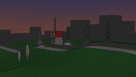
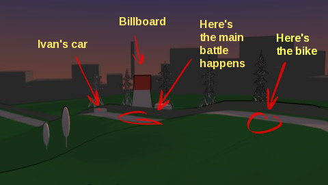
The place where Ivan and Morevna fighting with soldiers is a road near a (ghost?) town. There is a signs what some combat operations took here (on the road) place here recently.
Road is covered with a bodies of people dressed into the military uniform. There are a lots of broken guns scattered around. They all screwed by unknown force, some of them slashed into parts. One tommy-gun smashed by someone's foot like if it was made from a foil. There are also a lot of street-fighting weapon on the ground – debris, clubs, metal pipes, chains and hammers.
The concrete wall covered with graffiti images running aside of the road. Right behind the wall there is a high billboard construction - it is fixed on the armature stand. The bike of Marya Morevna on the top of the small rise of the road nearby. At the bottom of the rise Ivan's car is located (it's location marked with a white cube on the 3D map).
richardwad1 - Should the town be sort of futuristic? I picture it as a futuristic, run-down industrial town.
Zelgadis - Yeah! Also I have some concept ideas. What if buildings on the left side of the wall will be different from the buildings on the horizon? Buildings of town behind the wall will be normal buildings of a futuristic town. At the left side of the wall, buildings near road could look like steeped down into the ground, their bottom parts covered with huge blocks of dirt. Maybe in the past an earthquake caused the landscape change - it knocked up the hills at this place and caused buildings to collapse down.
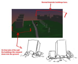 File:Battlefield-buildings-01.xcf
This is just an ideas. You may or may not follow them or suggest your own. It seems what those ideas are not make any significant influence on the background shots, but maybe some history details will help us to make this place more interesting.
Lighting and atmosphere
Time of the day: dusk.
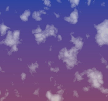
Sky: bright with a few clouds. Something like this:
(^ Don't look at the colors, just the clouds type.)
richardwad1 - How will we make the transition from the new brighter colors to the darker helicopter scene?
Zelgadis - Something like this: 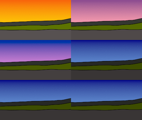 . It will happen at shot number 39.
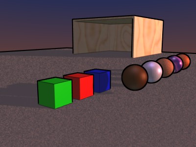
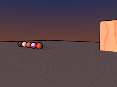
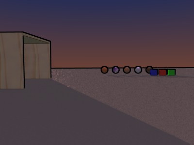
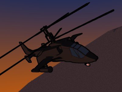
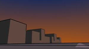
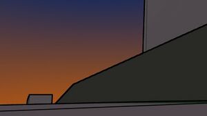
Lighting should be similar to exposed on pictures below:
Note: I don't like the sky colorscheme - it is too boring. Especially the top color - it should be more bright
Terrain
The terrain is hilly. There are a low hills at the horizon. Land is covered with a low dense grass. There are some standalone trees around - Aspens or Pine Trees (like here http://povrayscrapbook.awardspace.com/). Maybe a few bushes near the wall.
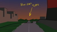
Type of horizon is shown on picture below:
richardwad1 - If possible, I could use a compass for the scene showing which direction is north so I know for sure where to place the setting sun.
3D layout
We have battlefield layout defined in 3D scene. It is here: File:Battlefield.zip (you need blender 2.48a to open it).
I placed some cameras and numbered them correspondingly to particular shots in storyboard. Some cameras are animated. I hope this will help to understand where main actions of the demo happen. No close ups, 'cause it's better to define general views first.
This scene also will be used to make general 3D panorama (shot number 7). But we need to do a lot of work on this scene before that.
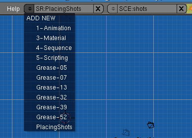
There are some Grease Pencil comments for particular scenes. To see them select view layouts which names starting with 'Grease-':
Backgrounds Shots
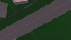
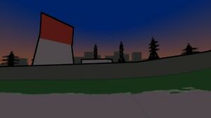
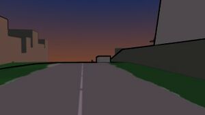
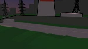
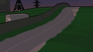
Here's a few rendered shots from the 3D layout.There are more - you could render it manually from source file.
We need to:
- draw detailed backgound images for each shot camera in 3D layout
- texturize 3D layout to correspond drawn images (for shot 7)
Idea: Maybe invite synfig community to make graffiti images on the wall?
richardwad1 - Which background image should I start painting first? Also, should I add lights on and around some of the buildings? Any light sources I add would have to be considered in the blender 3D models and in character shading. I think street lights would add to the feel. Also in the blender scenes where there is glass, like the tractor trailer, I had an idea. I once made a lavalamp in blender and used a white surface set to a low opacity(alpha) to make a nice glass effect. It would also be nice to use the effect to make small domes with lamps inside for the street lights/tower lights.
Zelgadis - I think you could start with any, but not shots 01 and 07. Shot 01 is view from top and it could be a bit complicated to draw before other shots. Shot 07 I planned to draw last, cause it's a base for 3D panorama - it is most complicated and detailed.
I imagine buildings without lights. But buildings should have glass parts to reflect/refract helicopters headlights. When sun goes down and helicopters appearing their headlights becoming a new lightsource for the scene. They moving, light is reflecting from glass and refracting through the falling petals. Also, for battlefield scene there is no street lights there. About scene with tractor trailer I not sure for now, have to think about it. In any case we could try to make a few variants and choose then.
richardwad1 status updates
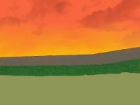
Just a quick update. I've been out of town for about a week. Getting back to work in the next couple of days. Leave any ideas/suggestions for the battlefield backgrounds here!
click on the thumbnail to see the updated picture. The thumbnails are not updating.
I worked a little on the grass and started doing some edging and color correction. I am still thinking about ideas for objects on the ground and a good gravel road texture.
Zelgadis: I would like to see the wall not red, but gray.
I changed the base color to a more gray color for illustrative purposes. The red was sort of a layout for damage from explosions. Should the texture of the wall be like a solid concrete wall or should it be smaller bricks? After I get the basic color layout I will merge all of the layers together and actually add in the details like a painting. I'm excited about getting to the painting part because then it will actually start to look good.
Zelgadis: The wall should be solid concrete wall. The road is paved by asphalt.
Some technical details. In shot 5 we have almost 2x zoom. If we want backgrounds to be suitable for HD quality (1920x1080), then the size of background image should be at least 3840x2160.
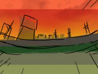
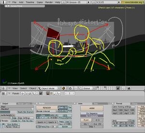
Also, I don't know is it noticeable or not, but there is a fish-eye effect applied to the background. I would like it to be more visible - maybe even bend road up at the borders of the screen. So final image will be even a little more wider.
Something like this:
richardwad1 - That's a pretty big resolution, but I will be getting a new computer soon to make it easier to work with large files. I didn't realize there was a fisheye effect. Is that on the blender files? I haven't checked all of those out yet. I was going by the sample shot on the side. My current computer doesn't work very well with my tablet. It actually skips quite a bit, so when I get the new one things will go much smoother and I won't have to use the mouse. I did a little experimenting with gimp and they have a really nice lens distortion effect. I turned up the Main to 10 and Zoom to 6 and it seems to get close to the desired shape. The Edges setting can also be used to get it even closer. It has more settings and I may be able to find tune it to get it exactly how you want. If you feel this is effective I'll go ahead and paint it as normal. If not, I can try to paint it from that perspective instead.
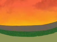 This image is awful, but it's a quick example of the filter in action.
Zelgadis: I don't know which way is the best if they gave expected result. But I'm afraid, what Fish Eye gimp effect won't produce the appropriate distortion for the buildings. Generally I consider drawing right from perspective as a better way, cause it is WYSIWYG. If you draw image as normal and after apply the fish eye effect - then you may or may not receive what you need. That's could be confusing and may force you to redraw everything. But maybe this way will give you better understanding of perspective distortions. So both ways have their own advantages and disadvantages.
The fisheye effect was mentioned in blender file. Please consult it to get clear idea about what's going on on the battlefield.
Richardwad1: I finally got my new computer! I should be able to get back to work soon. :)
Zelgadis: Cool! Good to hear!
